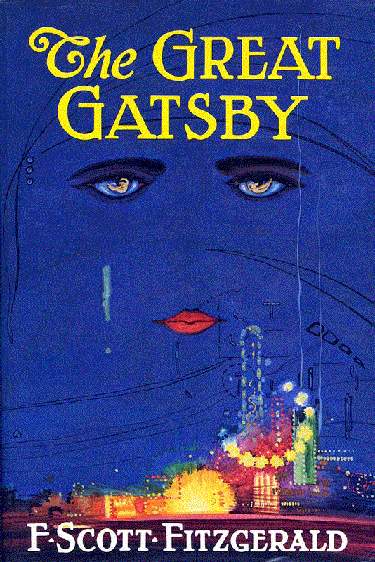
For our final Project in Typography we were tasked with recreating a book cover of our choosing. I decided to recreate the book cover for The Great Gatsby.
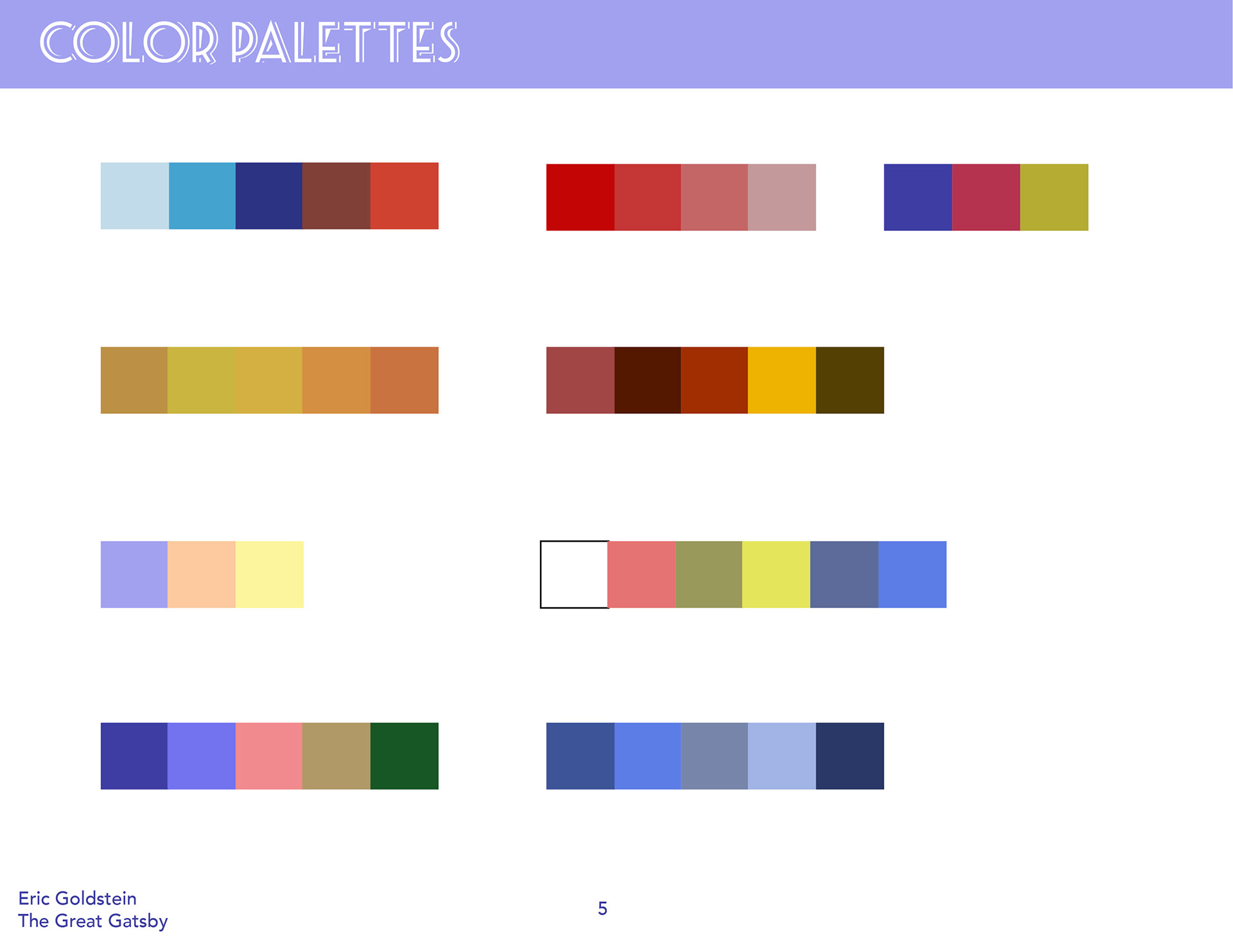
For my first task at hand was sketching out my ideas for how I wanted the layout of the book cover to look. Along with that I also had to decide which typefaces I would use for the book itself and color pallettes.
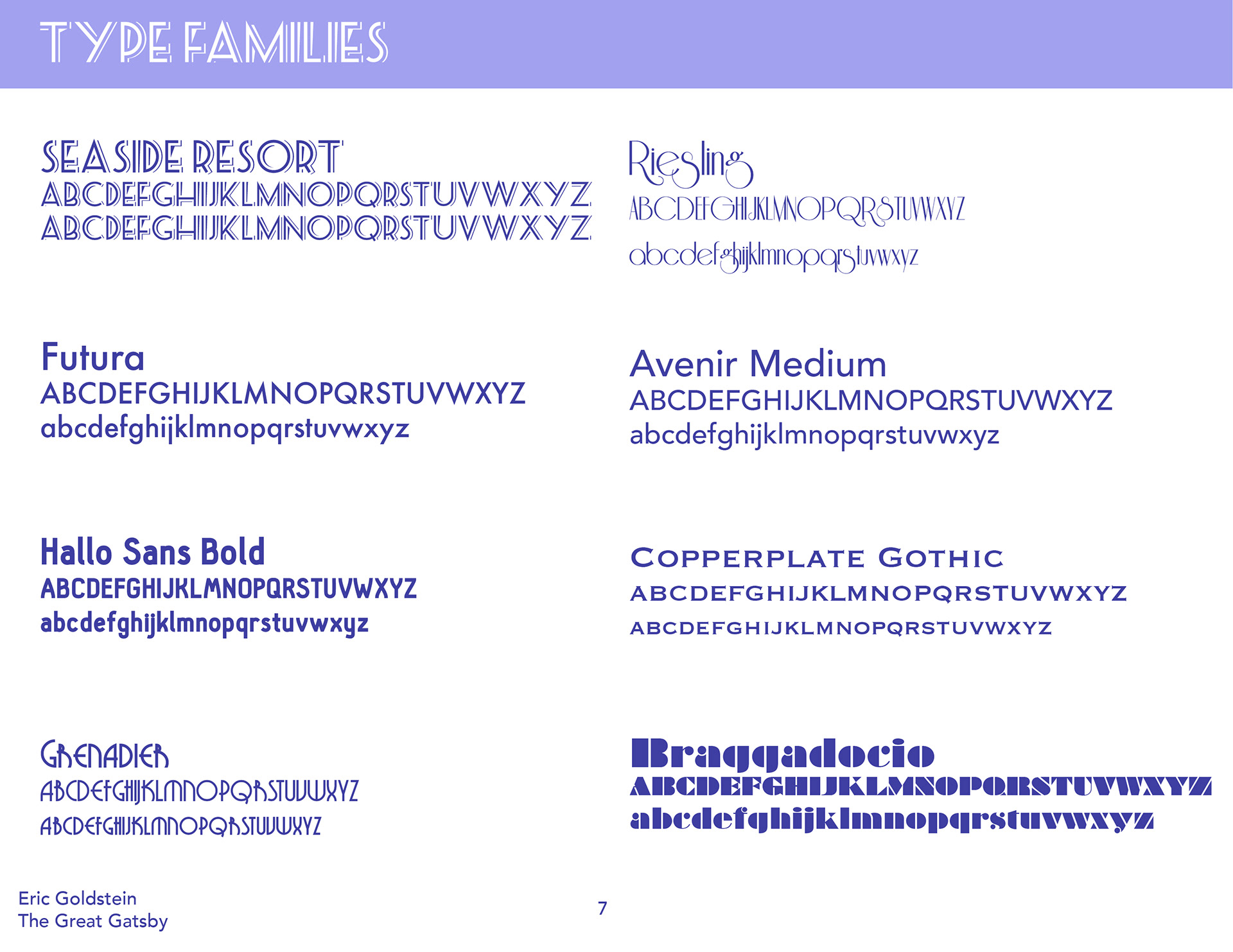
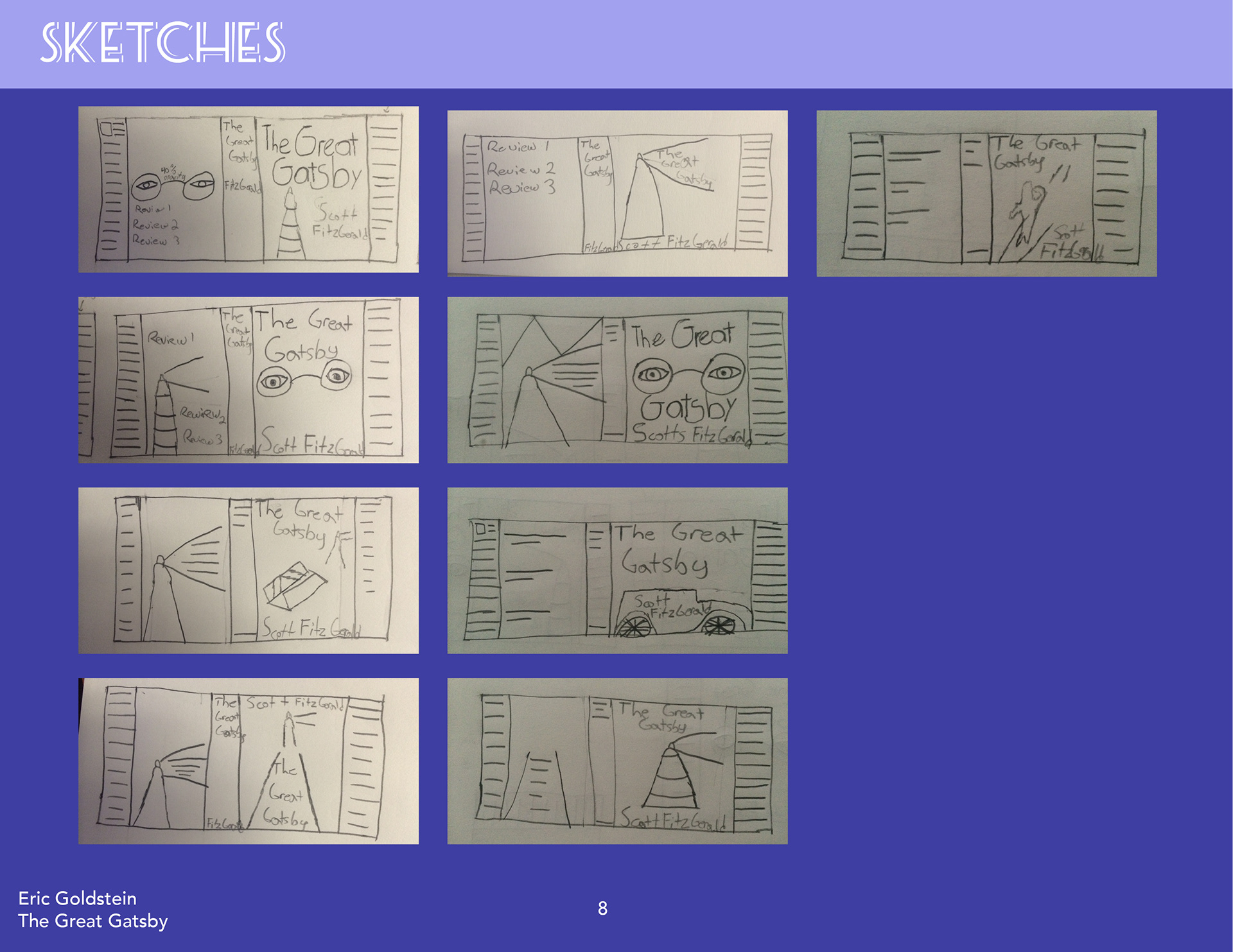
From there I decided to take 3 of my book cover sketch outs and bring them onto the computer. These were the 3 different Layouts that I had. for my type choices I decided to use Grenadier as the Title font and Futura as the body copy font.
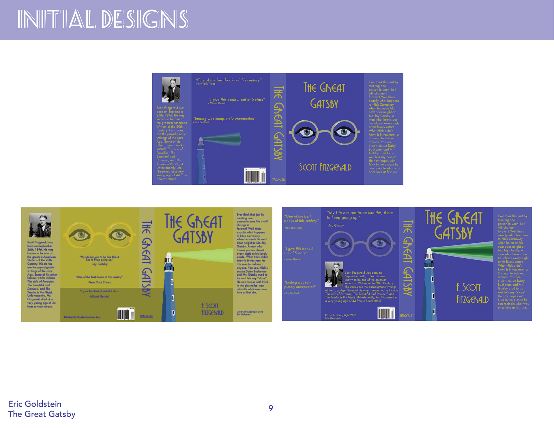
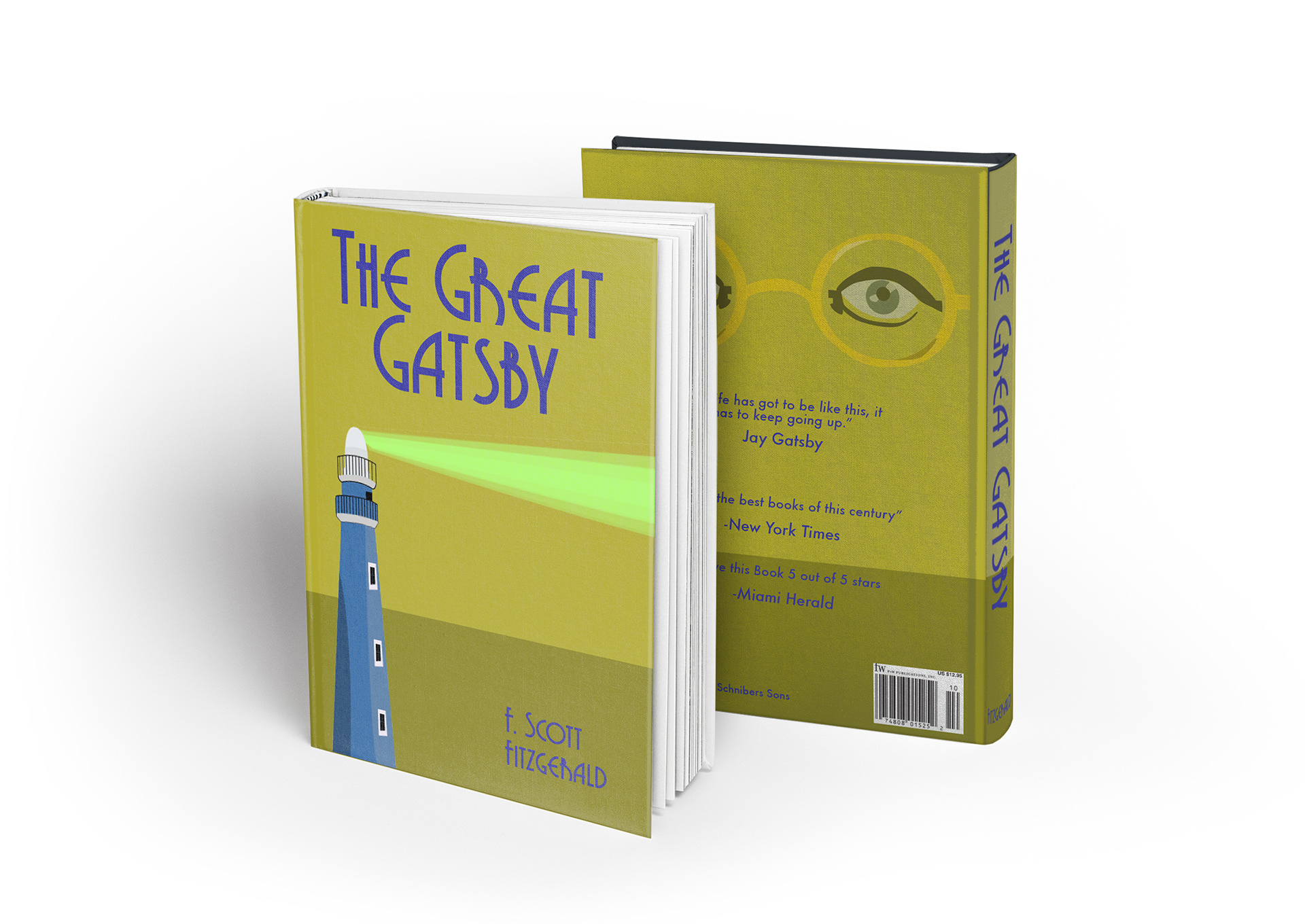
Finally after spending an entire week on this project I came to the final product. I used the lighthouse for the cover because I believed that was a very important point in the story that was overlooked. I believe the lighthouse is a symbol showing that Daisy and Gatsby's love still blooms. The glasses on the back cover represent Dr. T.J. Eckelberg from the book, his would always symbolize that the doctor is always watching you. but without further ado here is my final book cover design.